Projects
Innovation Federal Credit Union
Designing the digital foundation for a credit union that had none.
Role: Senior Product Designer (UX/UI)
Scope: End to end product design, customer journeys, UI library, mobile and desktop
Platform: Consumer digital banking, Canada
Team: Around 25+ people across England, Belgium, Pakistan, Canada and Turkey
Duration: 2020 onward, first phase live within a year
Overview
In late 2020, Innovation Federal Credit Union signed a ten year partnership with VeriPark to move from a branch based institution to a digital first one. They were VeriPark's first client in North America.
The starting point was blunt. Their last significant design work dated back to around 2010. They had no digital onboarding at all. According to VeriPark's published figures, only 2 percent of applications were processed straight through at that time.
I owned the end to end design across three surfaces: the public website, internet banking, and mobile banking. All flows, all screens. The call center layer sat outside my scope, as the client had asked for Microsoft's default interface there.
The scope ran to more than 200 pages each for mobile and desktop, with a seven hour gap between Istanbul and the client's head office in Regina. I reported to the PM and the Head of UX, and joined the client team's weekly sessions throughout. Delivery ran on VeriPark's VeriChannel platform.

Working without access to members
The client provided the target audience and persona definitions, and direct access to their members was not part of the engagement. Three personas came across from their own research: a primary audience of 25 to 34 year olds, with secondary audiences at 18 to 24 and 35 to 44. All three were digital first and phone led.
What I did with them was build the customer journeys. The personas described who these members were. They did not describe how anyone would move through a product that did not exist yet, and that was the part I owned.
Beyond that, the constraint shaped how I worked. Instead of generating my own research, I treated the weekly sessions as the validation loop, and I pushed decisions through the constraints that were actually observable: the third party systems we had to integrate, the regulatory naming differences across account types, and the straight through processing target the business was measuring itself against.
I was not the person closest to the member on this project. I was the person closest to the system the member had to move through, and that is where my decisions had to earn their place.

Two teams building the same brand at the same time
While we were building the banking platform, a local Canadian agency was rebuilding the credit union's own website in parallel.
They had produced a UI library alongside it, and that library was set to define how the brand looked across every digital surface, including ours.
It had been built to present well, not to be used. The type stack was a print family carried across without adaptation for screen.
Colour application was inconsistent across states and components.
Contrast between text and background failed in enough places that the library could not have carried a regulated banking product.
Raising this as a critique would not have gone anywhere.
Two organisations were involved, the agency owned the brand relationship, and I had no authority over their work.
It would also have landed as one designer's taste against another's.
So I stopped arguing and started measuring.
In the working sessions I shared my screen and ran their own colour pairs through Stark live, in front of the client and the agency.
Numbers on a screen are harder to disagree with than an opinion about green. That was the meeting where the position changed.
The library
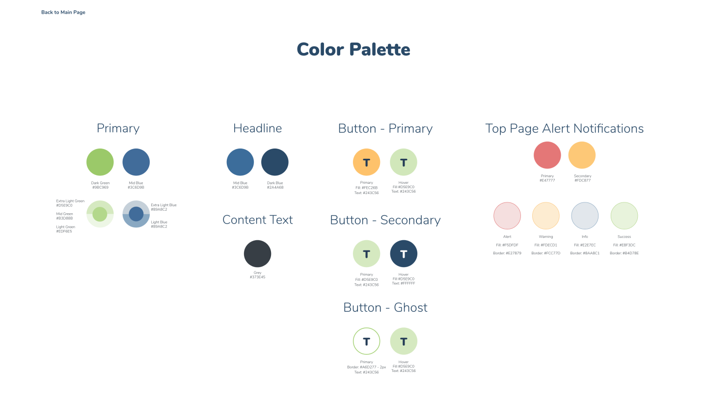
Then I built the alternative. Not a design system, a UI library, but a detailed one.
A 4px spacing scale, with major steps on multiples of 8 and minor steps on multiples of 4. A two column grid on mobile against twelve on desktop, with defined breakpoints. Type and colour rules resolved for screen rather than carried over from print.
Every interactive element carried its full state set. Focus, error, disabled and read only were specified alongside the default, for inputs, dropdowns, date pickers and every button variant. Loading states, alert patterns and timed elements were part of the library rather than decisions left to whoever built the screen.
I presented those rules to the client first, then to the agency. The agency adjusted their own library to match them.
That is the outcome I care about most on this project. The standard did not just hold inside the product I was responsible for. It moved into the brand surface I had no ownership of, through the people who did own it.



Making a decision visible before it could be made
Digital identity verification was the point where the project could have stalled.
The client was not resistant so much as unconvinced. Verifying a member's identity had always meant a person, a branch, and paper. A screen doing the same job was not something they could picture, and the default position was to keep the existing process and attach it to a digital product.
So I built the thing instead of describing it. I prototyped a liveness verification flow and walked them through it as a working journey rather than a slide. Once the step existed in front of them, the conversation moved from whether it was possible to how it should behave.
Canadian regulation meant the live implementation had to run through an accredited third party provider, so the prototype was never going to ship as built. That was not the point of it. Its job was to move an institution with no digital onboarding at all off a manual process, at the moment the decision was still open.
This was the second time on this project that showing beat explaining, and it is the habit I took away from it.
Designing around components I did not control
The verified identity step was one of three third party dependencies inside the same journey. A local address lookup service and Interac for money movement sat alongside it.
The identity provider brought its own screens. I designed everything on either side of them: the entry point, the framing that told a member what was about to happen and why, the return path, and the states for when the handoff failed or the member abandoned it midway.
This is unglamorous work and it is most of what onboarding actually is in a regulated market. A member who drops out inside someone else's interface still has to land somewhere that makes sense, and the journey has to read as one product rather than four stitched together.
Naming things a regulator has already named
Canadian regulation carried its own account naming conventions, and they did not map cleanly onto the structures the platform expected.
That pushed the interface toward flexibility rather than fixed labels. Components had to hold terminology that was not mine to choose, at lengths I could not predict, without breaking layout or hierarchy. A small constraint on paper that touched a large number of screens.
Designed mobile first, rendered once
Every flow in this product was designed for mobile first. Onboarding, transactions, servicing, all of it started at the smallest viewport and the decisions were made there.
The platform then rendered that same content body across breakpoints. Navigation diverged, the type scale diverged, the body did not. One structure, one hierarchy, one set of decisions, reused rather than redrawn.
That was a deliberate trade. Every choice had to survive the tightest constraint before it existed anywhere else, which is useful discipline in a product where a member is opening an account on a phone in a parking lot. It also meant desktop inherited a layout built for a narrower space, and did not always use the room it had.
Where the two genuinely could not share a pattern, I split them at the component level rather than redrawing the page. Selection is the clearest example. On desktop a dropdown expands in place, with account name, type, number and balance visible in each row. On mobile that same selection routes to a sub page instead, because the rows carry too much information to survive being crushed into an overlay. Same decision about what a member needs to see, two different mechanics for showing it.


Outcomes
The results below are published by VeriPark and Innovation Federal Credit Union. They belong to a ten year, multi product transformation and to the partnership as a whole, not to any individual. I designed the foundation the digital channels were built on, in the first phase of that programme.
-
Straight through processing moved from 2 percent to 65 percent.
-
An 8 fold increase in digital onboarding.
-
Application completion rates rose by over 55 percent.
-
More than 61 percent of members now bank digitally.
-
Innovation ranked first in Net Promoter Score across all Canadian financial institutions in 2024.
Sources: VeriPark, Innovation Federal Credit Union transformation and VeriPark, Innovation Federal Credit Union advancing digital banking collaboration.
What I would do differently
Mobile first served the journeys well. Onboarding, transfers, servicing, anything with a beginning and an end benefited from being decided at the tightest constraint first. Transaction history, statements and account detail views did not. They inherited the same content body as everything else, and dense financial data is one of the few things that genuinely wants more room rather than the same structure at a larger scale.
I would also push harder on the interaction layer, navigation in particular. The structure was sound and it shipped, but the menu deserved more attention than it got.
Both come back to the same root. Without access to members, I had no way to test whether a more ambitious pattern would have landed, and in a regulated banking product that is not a risk you take on instinct. Given the same constraints again, the thing I would fight for at the start of the engagement is some form of validation, even a narrow one. It was the single change that would have improved every other decision on this project.

An alternative direction explored early in the project.